






Pre-teletext
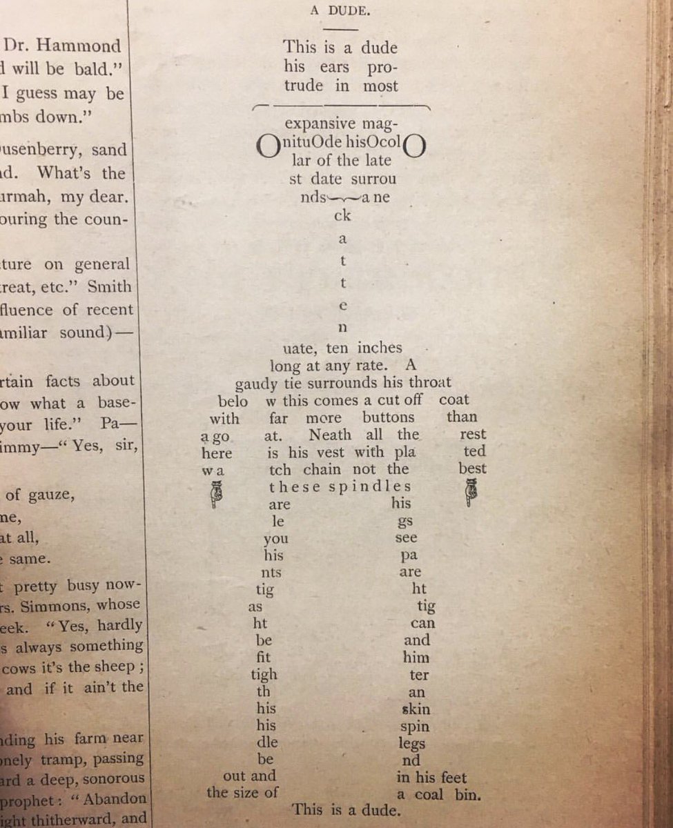
Teletext art has its ancestral origins in the mosaics and cross-stitching first documented in ancient times, as well as poetry using letter arrangements to enhance its meaning – a forerunner to modern concrete poetry.
Letterpress printing was first utilised in the 1st Century AD, eventually enabling ‘movable type’ to spread text art en masse in books from the 11th Century, and newspapers from the 16th Century.
Typewriter art gained prominence in the late 19th century, followed by teletype art, which used Baudot code (popular before ASCII) to print fixed width characters on a structured grid.
The 1960s were the very start of the home computer era, when electronic character generators and viewdata technologies were being investigated. This gave birth to semigraphics – pixel mosaic and box drawing characters that accompanied regular alphanumeric ones, allowing the creation of more intricate designs in textmode art.
Teletext emerged in the late 1960s and early 1970s as technologists were finding a way to print teletype on a computer monitor.
1970s
Page layout development
John Adams, having just graduated university, developed teletext while at Philips in the early 1970s. At the time he had been building systems with 80 characters per line for computer entry (an early industry standard), and approached his manager Gerald Crowther with a plan to reduce that to 60 characters.
However, having thought about it over half a pint of Guinness, he realised they had to be big enough to be viewed on smaller televisions, settling on 40 for a proposal to the BBC and IBA.
“If you read on the Internet, they say, “why did the designer, like, uh- isn’t he an idiot, make the characters so chunky?” The reply to that is, you try and do this on 1970 technology on a budget. Why it’s chunky is because it was the only way of getting … that number of characters and keeping the price low … There’s not much you can do.”
–John Adams, developer of teletext
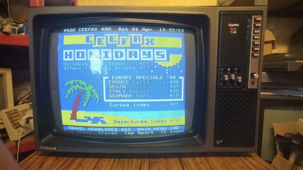
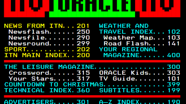
In the following years, the BBC would conduct testing for a service that would become Ceefax. At the same time, the IBA were developing their own teletext service later known as ORACLE, and the Post Office were working on their own viewdata system later known as Prestel.
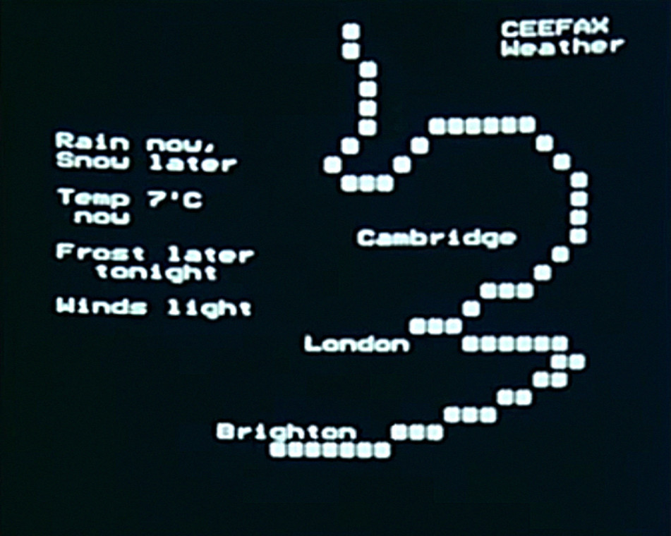
A BBC TV segment on new technology from around 1973 featured a prototype version of Ceefax. A weather page outlined South East England using what appears to be hash symbols, the first semblance of simple design elements achieved with teletext’s alpahmosaic characters. Teletext was designed with information in mind, and the graphic mode facilities were initially developed to display weather maps, graphs and charts.
In 1974, the BBC, IBA and BREMA established a unifying standard for the format, paving the way for Ceefax, ORACLE and Prestel (and subsequent teletext services) to have the same number of characters on screen. This was solidified in the 1976 Broadcast Teletext Specification, and later the World System Teletext standard.
Birth of Ceefax
Shortly after Ceefax was launched in September 1974, employees began to experiment with graphics for headings and logos. However, it took some time to learn the key presses for mosaic characters with different combinations of pixels, and as there was initially no crib sheet to reference, programming graphic elements was time-consuming.
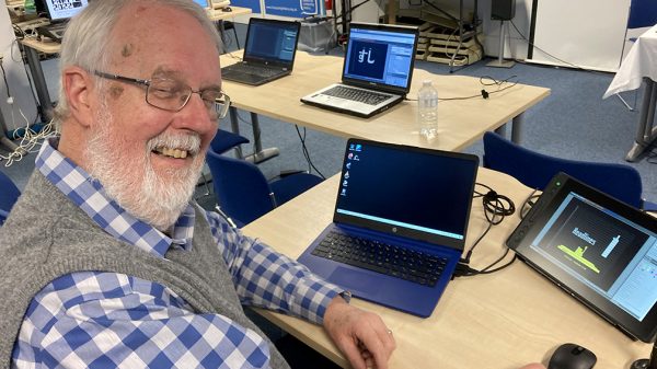
Ian Morton-Smith (Mort Smith), first salaried employee at Ceefax, is shown coding some teletext graphics in the 1975 feature This is Ceefax. By typing letters that correspond to graphic shapes, he draws a pixel heading that reads ‘Headlines’. In subsequent years, this would become a ‘party trick’ that he demonstrated at Teletext Block Party meetups.
Ian Irving, also one of the first cohort of journalists in the Ceefax newsroom, embraced the trial and error nature of learning teletext graphics.
“In the very beginning, we were hardly aware of the graphics capabilities. We hadn’t been started very long before we latched onto it and found that teletext had this graphics facility that could be played with. That was great fun and we all dived in because it was a fairly apparently straightforward, simple kind of graphics to create. But the results were very mixed, and I was particularly concerned that it shouldn’t look amateurish, so that was really my kind of aim.”
–Ian Irving, Ceefax
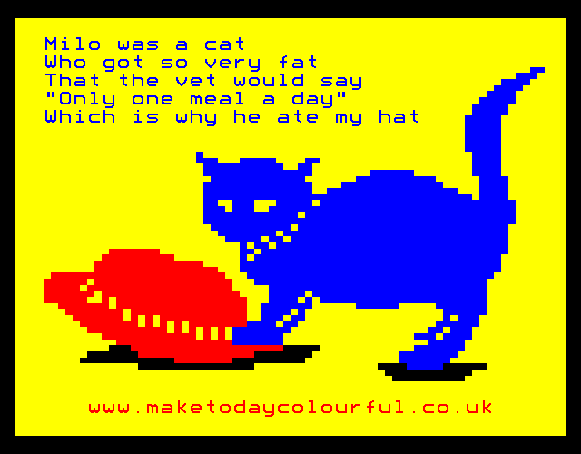
Irving proposed a “sequence of abstract whole-screen graphic patterns on rotating sub-pages,” not unlike a modern screensaver so viewers could have something to watch on their “otherwise idle TV screens”. Though his idea was not implemented, a different one was taken up: a “back page” of designs (“where nobody would see them anyway”) relating to cat puns: “catastrophe, catatonic etc.”
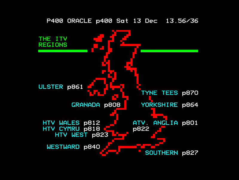
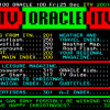
Meanwhile, the IBA were working on ORACLE, which although “less ambitious” than the BBC’s efforts, was always planned to carry classified advertising. For the time being, graphics were limited to headings and the occasional map; a 1975 recovery of ORACLE shows a ‘regions’ page that utilised a basic graphic mode map.
Teletext graphics remained a largely experimental medium for a while (indeed, the teletext broadcasts themselves were still regarded as experimental for a number of years) as the news and information elements became a priority, with artwork taking a back seat.
The first (recorded) full-page teletext artworks
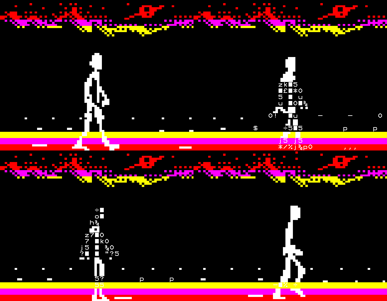
The closing credits to the BBC’s July 1975 feature This is Ceefax displayed a number of whole-page teletext artworks from the service, including a simple animation of two cars colliding. The full animation, viewable on Ceefax at the time, had three frames that automatically scrolled through on a carousel. Other artworks included a boat with flashing text effect on the water, a winter skyline and a multi-coloured tunnel.
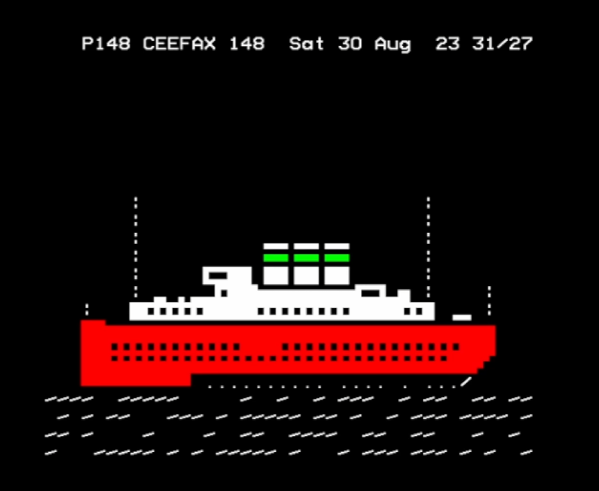
A recovery of the service from the following month, August 1975, shows more full-page art: a geometric square pattern, a Mondrian-esque minimalist piece and another, larger ship graphic by Mort Smith.
Of note here is the fact an older character set was in use at this time, with liberal use of a division symbol – closer to a slash than the modern division sign – making up the sea. The purpose of these artworks was to exhibit what the medium was capable of graphically. There was also a pixel typeface created by Ian Irving, which Ceefax tasked viewers with naming.
Sources
- Interview With John Adams, Inventor, Creator of Teletext, Byte High No Limit, 23 January 2025
- 1976 Broadcast Teletext Specification
- This is Ceefax, BBC, 15 July 1975
- Teletext People: Mort Smith Ceefax, Intelfax 4-Tel, 3 November 2022
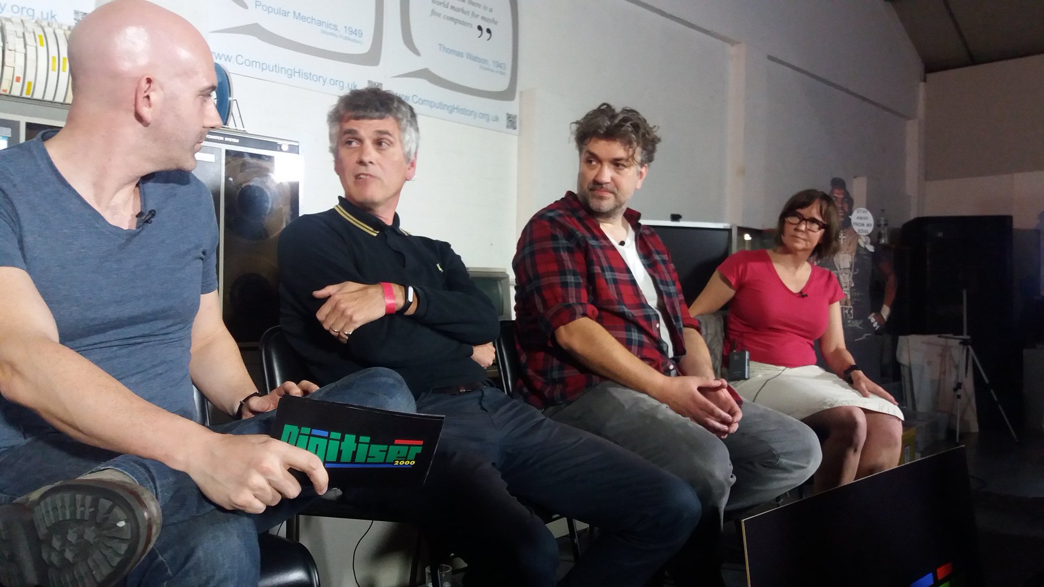
- Teletext 50 – Teletext Artists Panel with Paul Rose, Ian Irving, and Steve Horsley, uploaded by Jamie Nemeth, 27 March 2025
- Teletext Sofa Club Interview With Jason Robertson, 1st April 2021
- In Vision Episode 1 – Ceefax from 30th August 1975 uploaded by The Teletext Archaeologist, uploaded 24 December 2021





Recent Comments