



Styles
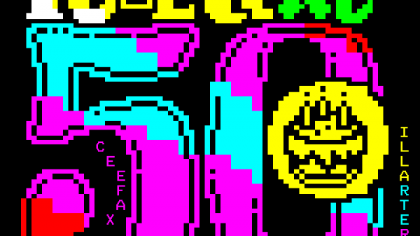
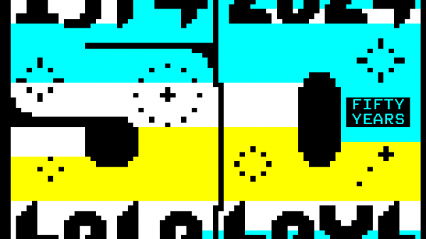
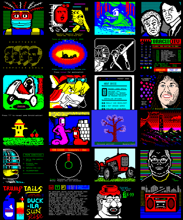
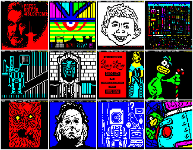
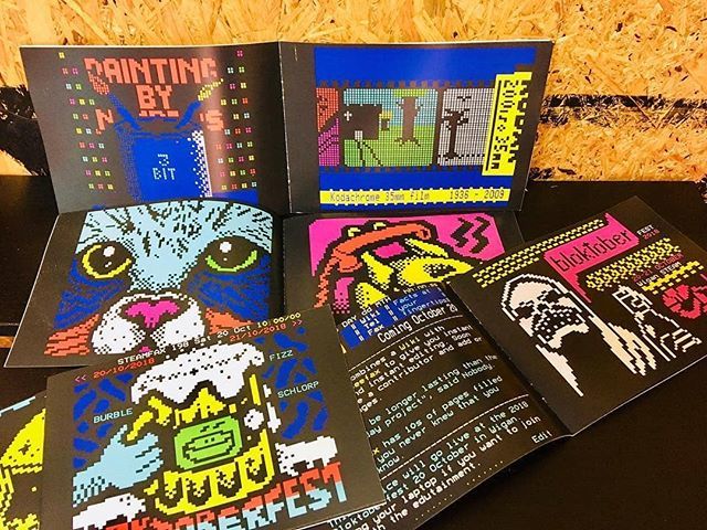
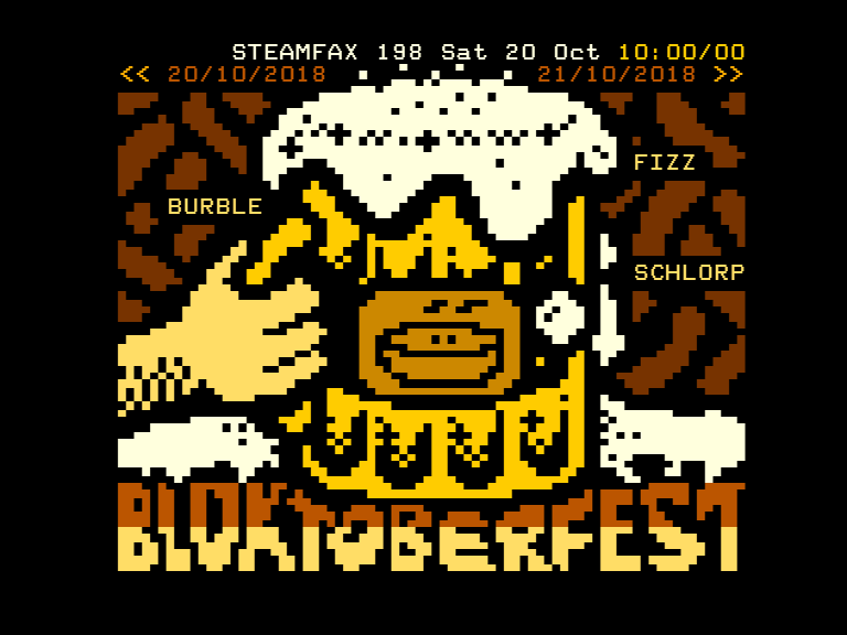
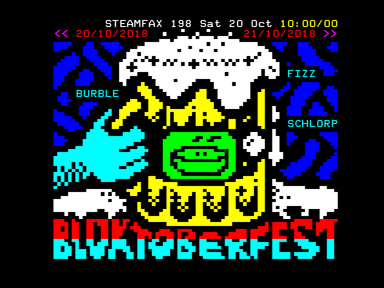
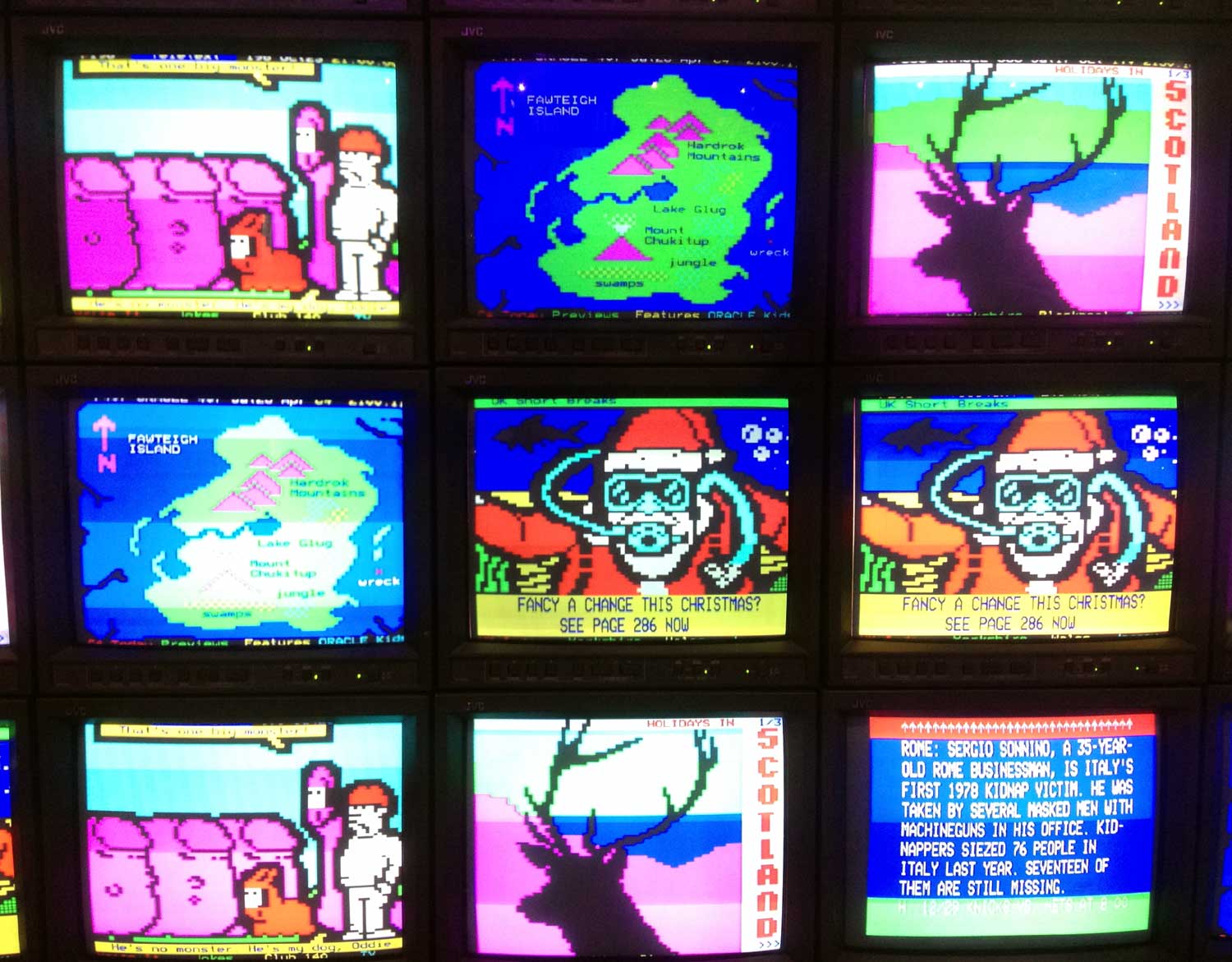
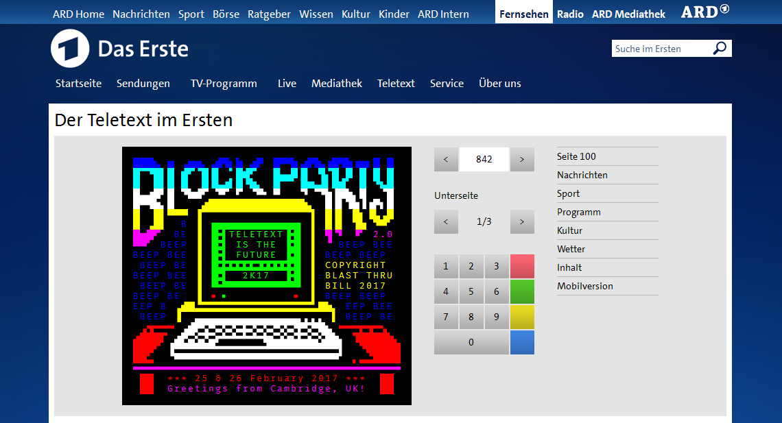
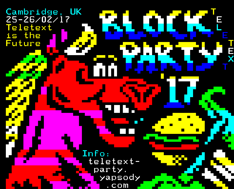
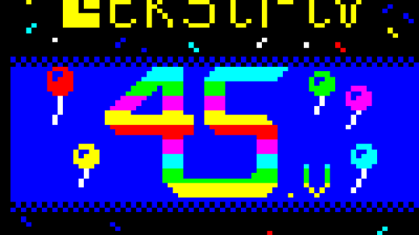
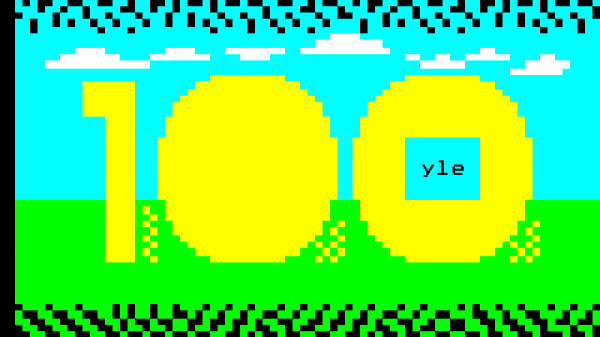
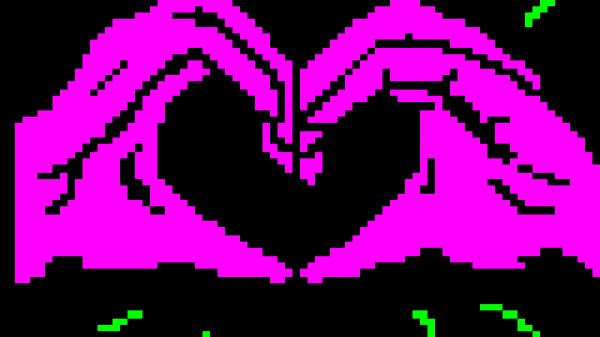
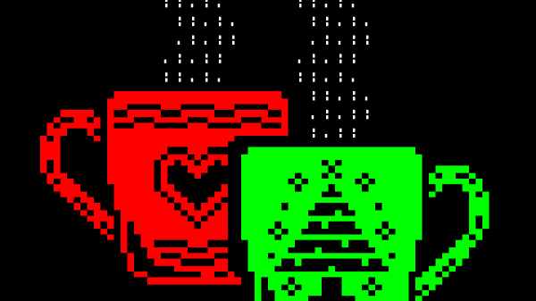
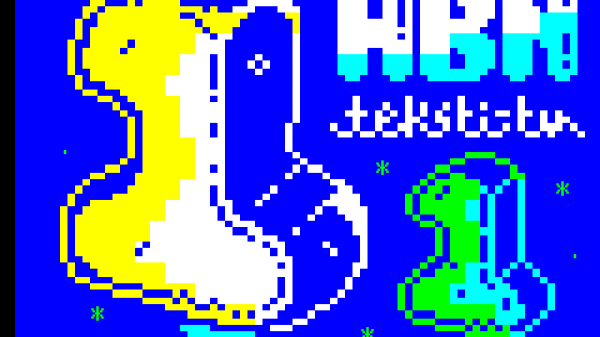
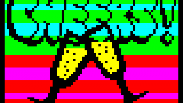
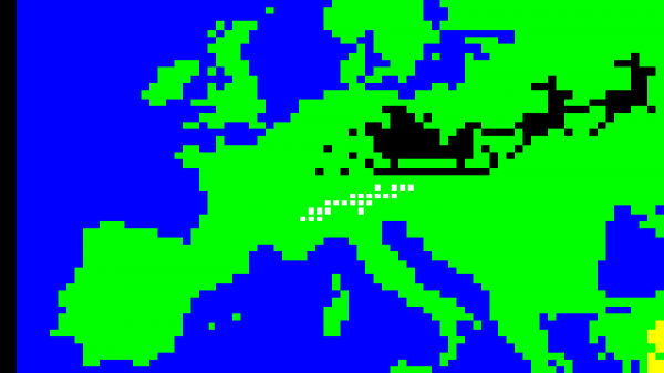
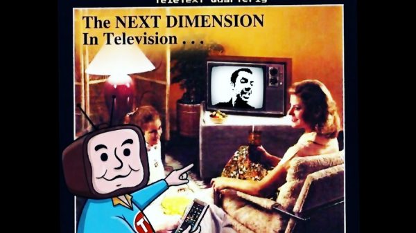
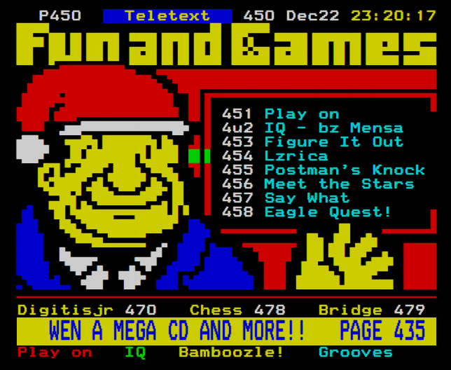
Despite its restrictions, teletext is capable of facilitating a variety of styles. It may carry a certain aesthetic, but as a medium it provides a canvas limited only by the artist’s imagination and proficiency.
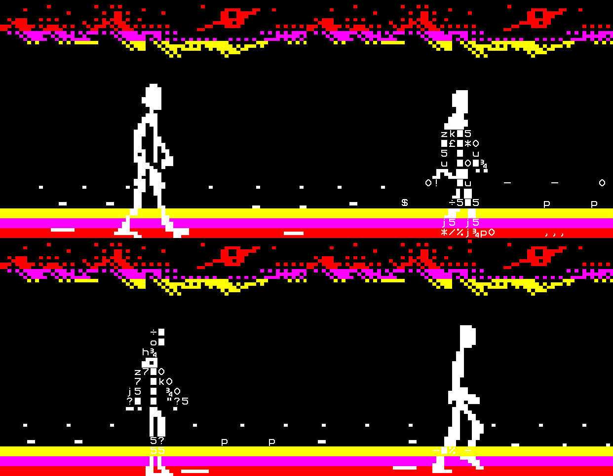
However, designers have found ways to play to teletext’s strengths. For example, Ceefax and Intelfax’s Ian Irving thought a black and white engraving print of Malta might translate well to the format as it contained no “shading or graduations at all.” He later regarded this version as one of his favourite works because he had “discovered one way of using the limited graphics that [they] had.”
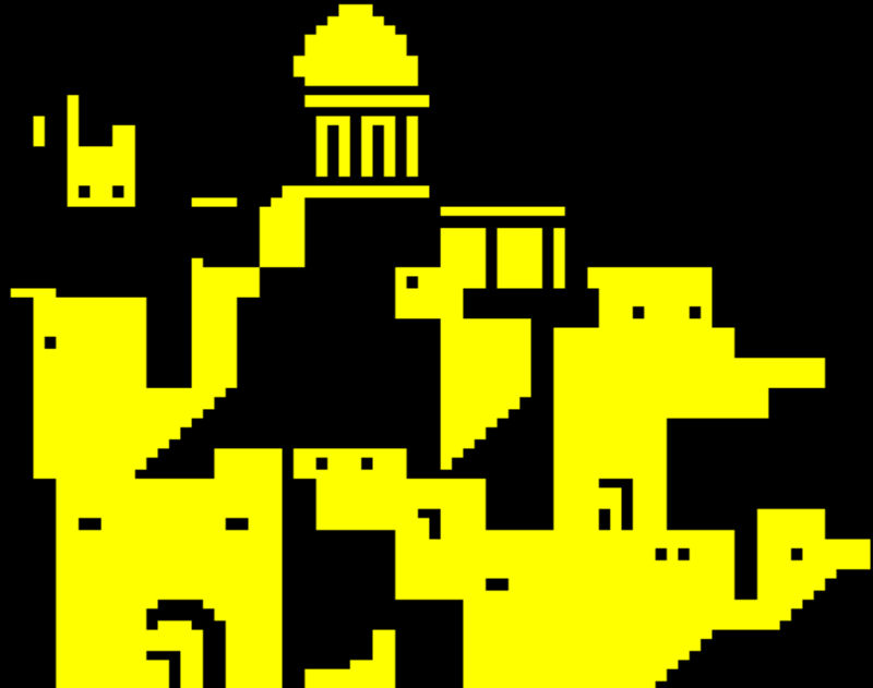
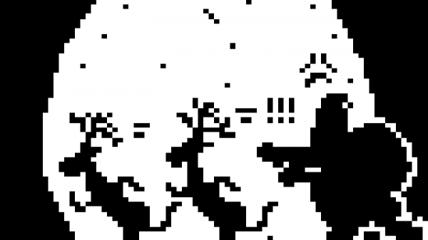
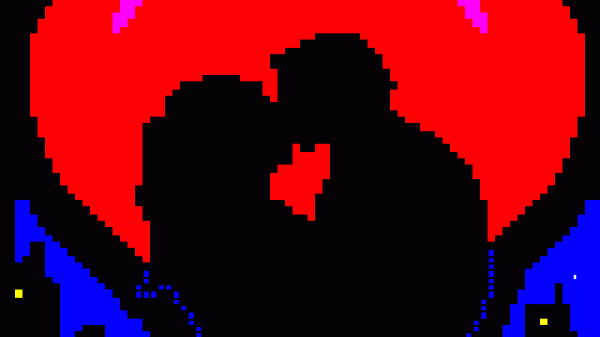
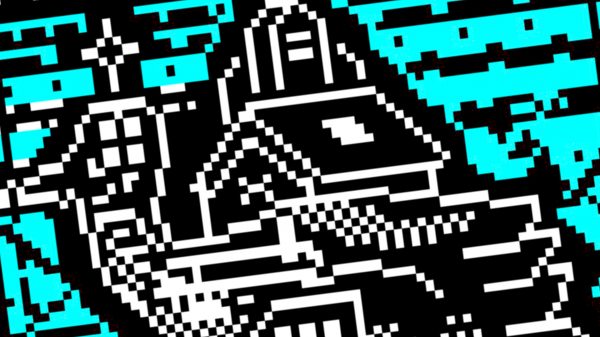
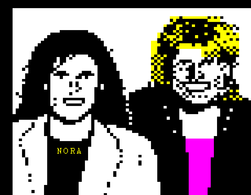
This heavy contrast between light and dark also brings to mind comic book and pop art, as well as monochrome prints. Speaking in 2020, Jarkko Räsänen of the FixC cultural collective said that he didn’t consider himself a pixel artist because he wasn’t “good at drawing things,” but he used different techniques in his teletext artworks, a bit more like “appropriation art”. He also said that teletext is a “very special and unique form, kind of similar [to] printmaking techniques in the history of art.”
Through digitisation tools such as Image to Teletext by Tech Rob and Image2Teletext by KieranHJ, one can apply dithering to achieve results reminiscent of the graphical user interfaces on early Macintosh computers. This style is sometimes known as 1bit pixel art, an early example of which would be Susan Kare’s icons for the Macintosh 128K.
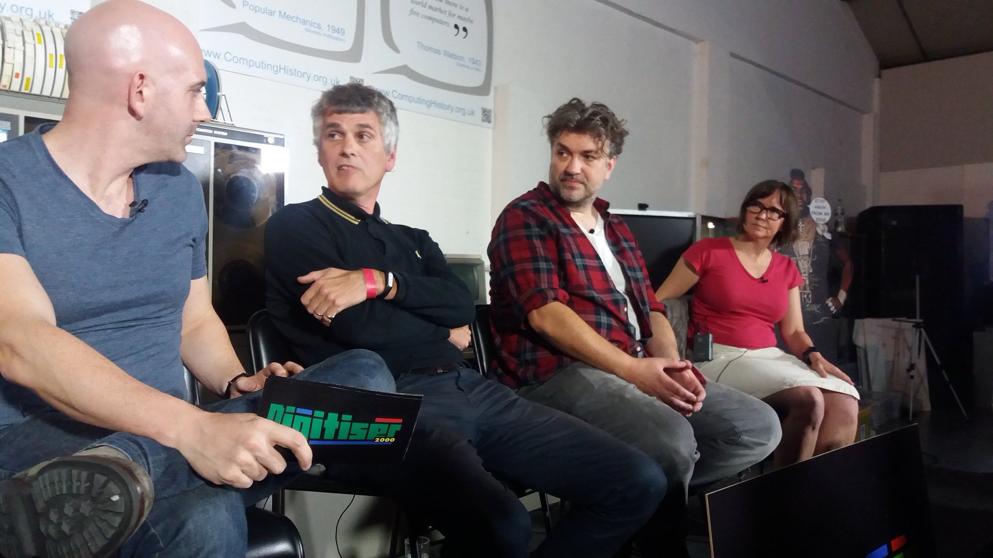
Teletext artists have also drawn parallels between their work and sculpture. Speaking at the Teletext-Digitiser Festival in 2016, Steve Horsley suggested his technique was “more of sculpting” shapes and “blocking them out” rather than drawing them, harking back to more traditional styles as opposed to contemporary digital art or coding.
Composition
As an artform, teletext is subject to the same composition techniques employed across the visual arts.
Teletext designers have added perspective to their art in different ways. Ian Irving said he would “try to put a kind of dimensionality” into his work, citing the 3D scenes in The Fantastic Adventures of 4T where the characters were travelling down a passageway. He would use perspectives so the page wasn’t just “a flat screen map of mosaics” so it had “a kind of depth” to it. He suggests that might be part of what distinguishes his work from other artists’.
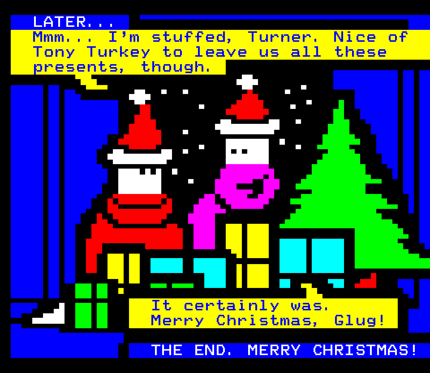
Teletext’s Paul Rose said he employed “a sort of” perspective with colour in Turner the Worm, giving an example that the back of a cave “would be black, and then when the cave was near it’d be the blue,” adding that his backgrounds were very often blue. He suggests this was, in a way, playing with the audience “psychologically” when it came to perspective.
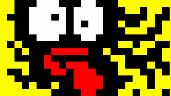
Regarding the use of negative (black) space on a small canvas, Rose remarked that it’s almost “the absence,” the “space between pixels” that suggests things, and “the brain fills in the gaps.” He mentioned a portrait of the Beatles he created, saying, “they [were] tiny little graphics but somehow you [knew] who they [were],” pointing to the shape of the hair, eyes and face. He concluded that “you need to give the brain just enough information, providing it’s a familiar enough thing.”
Speaking in 2024, Steve Horsley noted that the “more interesting” part of a page for him to design was the background, which took him “twice as long to work out, because it’s not the actual [foreground] design.”
Use of character codes
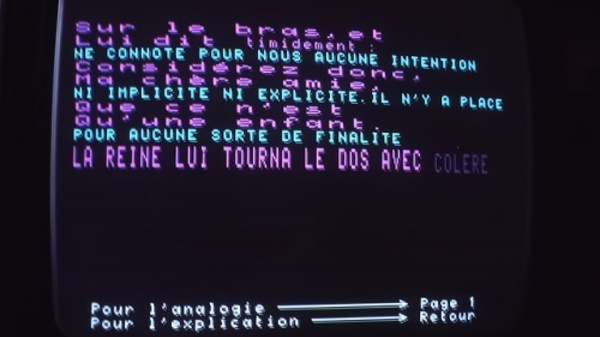
Teletext poses a unique challenge in that ordinarily, any space on the grid occupied by character codes cannot contain graphic or text mode characters. The exception to this rule is hold graphics mode (activated in the same way as graphic/text mode), which fills the black spaces with character information placed in the space directly to their left.
Peter Kwan, engineer for Ceefax in the 1980s and 1990s, opined that the problem with hold graphics is “nobody really understands” how they work. He went on to say that despite being “a bit difficult” to use, “it does allow you more than one colour on a background without having to have a black border.”
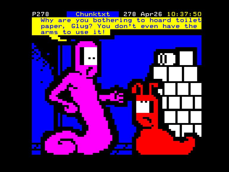
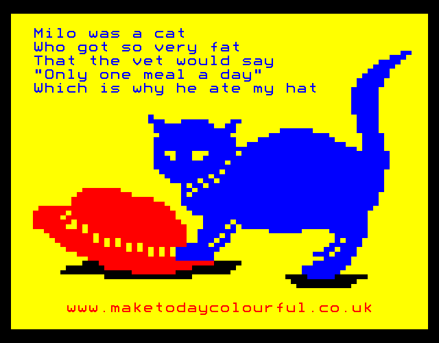
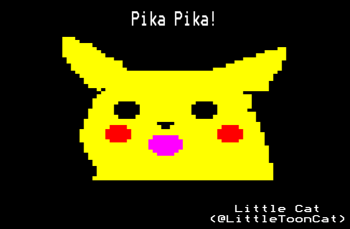
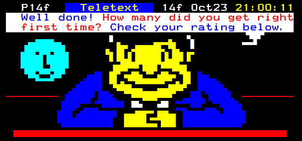
While at Teletext, Paul Rose popularised the ‘halo’ technique, hiding character codes in what would appear to the viewer as thick black outlines. At the Teletext50 Artists’ Panel in 2024, he said that he always “hated using” background colour codes, preferring to “have a black border around everything that [he] drew.”
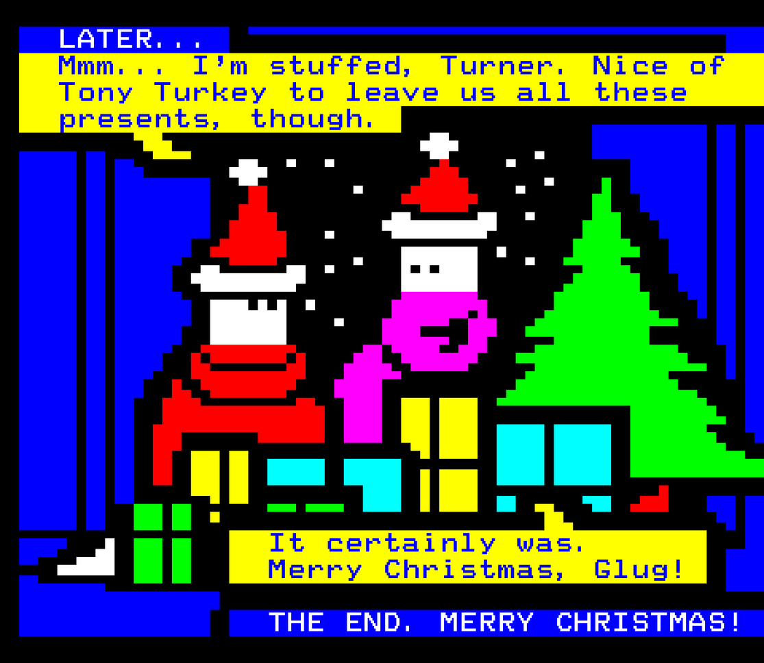
Steve Horsley, who worked alongside Rose at Teletext, albeit in the sales and marketing department, echoed this sentiment. He commented that he liked using “the black background, the black border around, especially if you’re doing a cartoon,” because “it looks neater.” However, he qualified that it’s “just personal preference rather than any other reason.”
Simon Rawles, creator of the edit.tf editor, remarked that hold graphics were equally tricky to implement in his software, “the bane” of a teletext frame renderer or editor’s lives, “or at least a recurring topic in the bug tracker.”
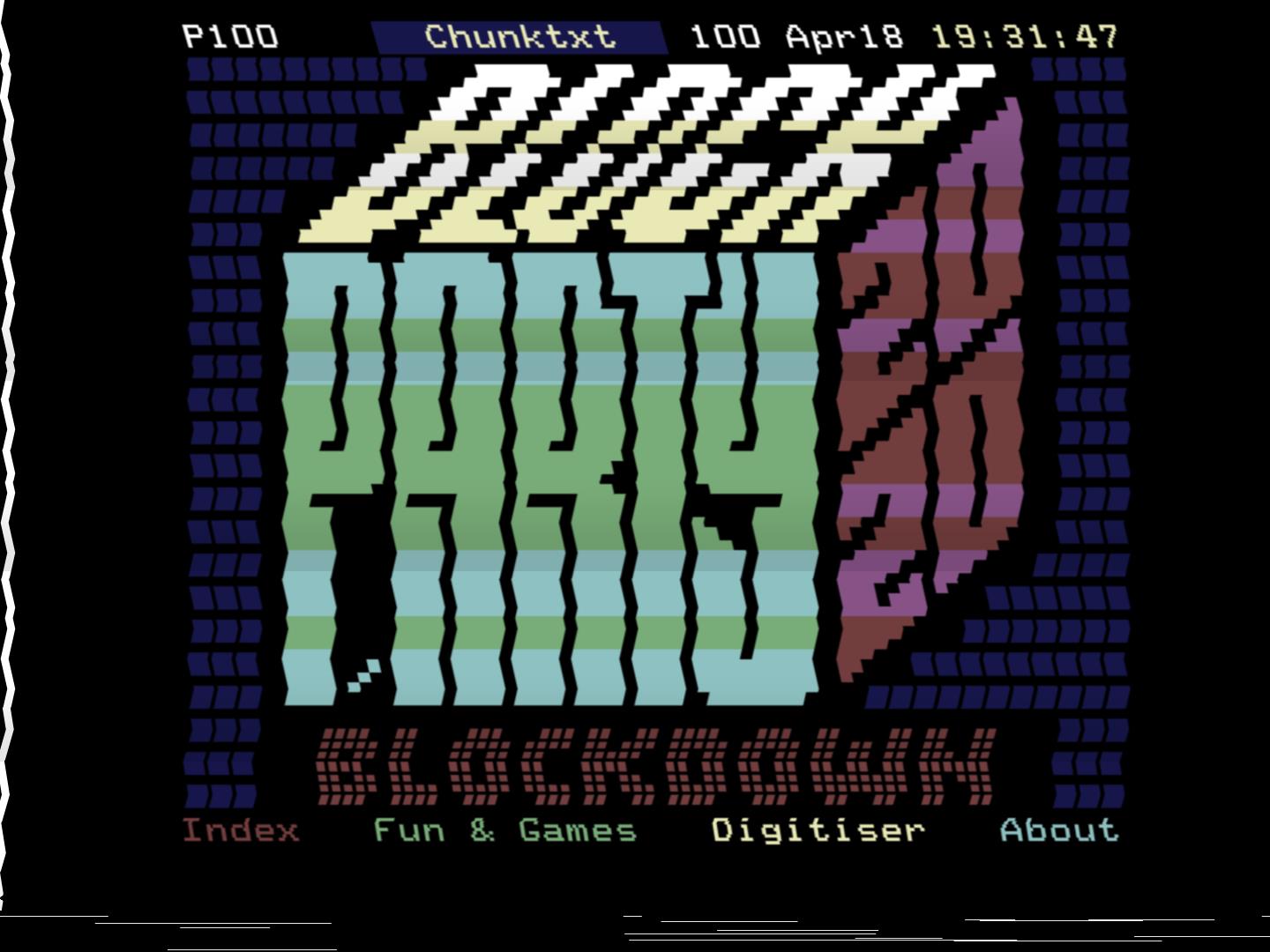
Teletext artists that have made extensive use of background and hold codes include Wim Dewijngaert, Sarah Burgess and Alistair Cree, shown in their entries for the TARL-organised exhibitions on Yle Text and other services.
Text-graphics balance
Teletext is, first and foremost, a text-based system, focusing on information in written form. To different extents, artists have had to work around this restriction when incorporating their graphical designs.
In 1979, the General Post Office funded Mills and Allen to produce a report based on a test period for the blossoming Prestel system, which uncovered techniques (limited though they were) used in Prestel page design. It found that IPs were unwilling to render their logos in “lego block” [sic] form, opting for economy of information over graphic mode embellishments. Equally, it was rare to find a provider that opted for the luxury of full-page artworks at this time, though examples did exist to show off the system’s graphical capabilities.
Sara Scott-Rivers, speaking about her time working for a local teletext channel in the 1990s, said the job was “a mixture of design, logos, and information,” and that it was “more design but also editorial, you had to have a bit of a concept of the editorial side of it.”
“There’s no point in having half a page of a beautiful picture of a flower if you’ve got to get ten lines of really important information out. So it’s sort of striking a balance. You have to think further down the line about, “What am I trying to say with this, and much words does it need, and how much pretty stuff can I get away with?””
— Sara Scott-Rivers
Sources
- What is hold graphics mode? (archived from the original), Simon Rawles, accessed 16 April 2026
- Teletext 50 – Teletext Artists Panel with Paul Rose, Ian Irving, and Steve Horsley, uploaded by Jamie Nemeth, 27 March 2025
- Teletext R Podcast, 15th April 2021 – Ian Irving (Ceefax/Intelfax), teletextart.co.uk 24 April 2021
- Teletext Fest 2016 – Artists Panel with Paul Rose and Steve Horsley, teletextart.co.uk, 9 October 2016
- Teletext People: Paul Rose, Byte High No Limit, 5 January 2023
- Teletext R Podcast, 5 May 2020 – In conversation with Jarkko Räsänen: teletext art festivals and museums, teletextart.co.uk, 5 May 2020
- Teletext R Podcast, 31 August 2020 – Sara Scott-Rivers of Teletext Ltd, Datasolve, ITM, GWV and Videotron, teletextart.co.uk, 31 August 2020





Recent Comments