













A “test service” of Prestel was officially launched in 1978. This system was fundamentally different from teletext in that it was a form of two-way communication, with users requesting information from a central database via telephone lines. Hence, they were charged on a per-page basis, meaning economy of information was more important than with teletext systems.
In a report funded by the General Post Office and released in 1979, Mills and Allen consulted with a panel including designers and art professors, all of whom familiar with Prestel provision, to determine how the medium could move forward into widespread use.
The report acknowledged that “writing for Prestel should not be considered in isolation from the overall graphic design of the Prestel page.” However, it also found that most IPs (Information Providers) were “unwilling for whatever reason to “build” a large typeface using the graphics keys.”
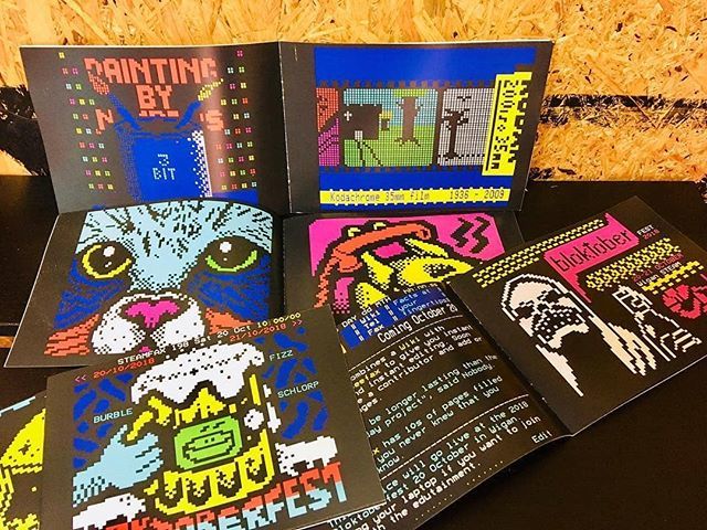
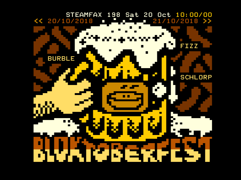
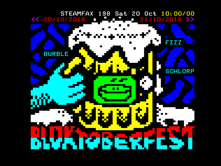
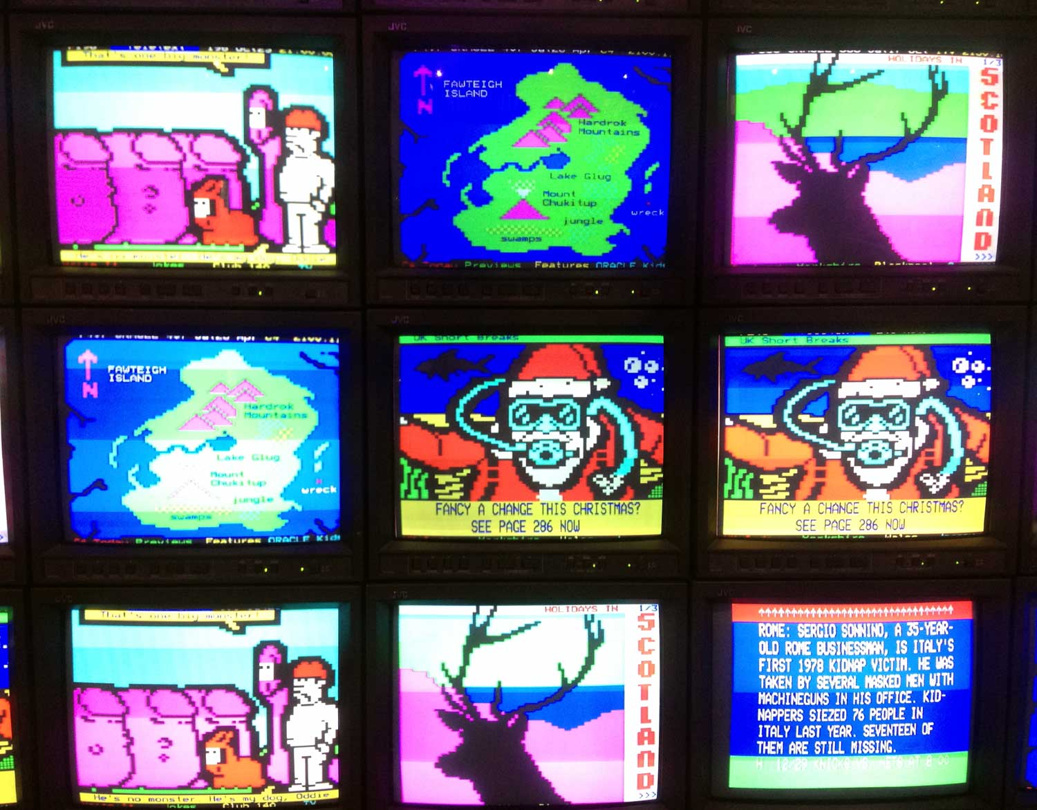
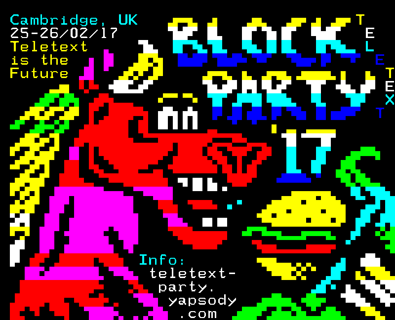
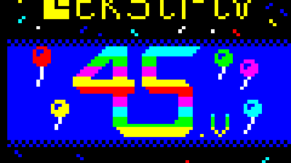
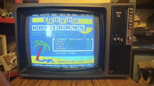
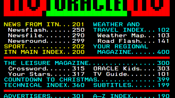
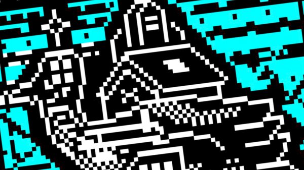
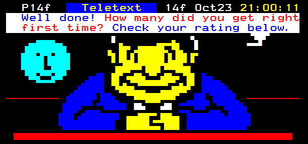
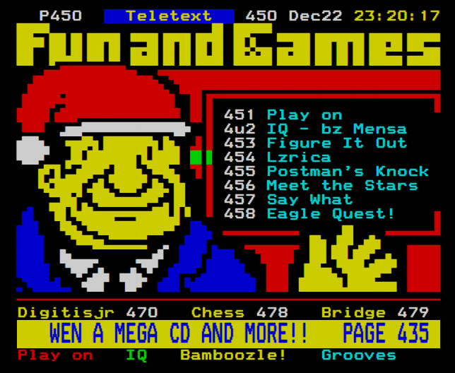
“The graphic matrix of 3 x 2 is not fine enough to reproduce many IPs’ logos in anything but a “lego” representation, and similarly limits the design of any other motif. … [The designer] must aim to produce pages at once attractive to the eye and intelligible to the mind, and yet economic for him to create and maintain, and economic for the user to access.”
Designers gravitated towards the more “luminous” colours of white, cyan and green for text mode, with the darker shade of blue used more in graphics mode. “Good graphic design,” suggested the report, “will tend towards a few colours on each page which combine well, and away from “rainbow” colour schemes.”
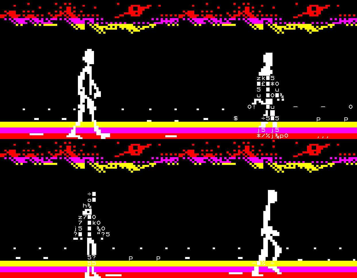
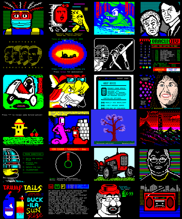
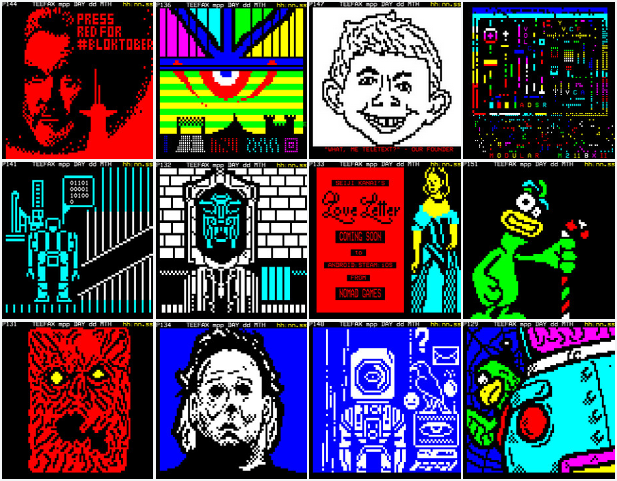
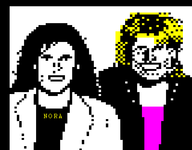
However, the cost of receiving Prestel pages meant there were fewer opportunities to exhibit elaborate artworks than on teletext. In a seminar on 17 November 1978, journalist and author Rex Winsbury noted that his company Fintel “seldom [used Prestel] graphics, apart from advertisements and the occasional bar graph.” He stated, “the audience won’t love you if you charge 5p for a picture,” but at the same time presented graphics from other IPs “including designs of people.”
The Central Office of Communication’s John Barran agreed that “graphics were seldom used,” though he did note a pixel image of a car “for the benefit of people at a motor show.”
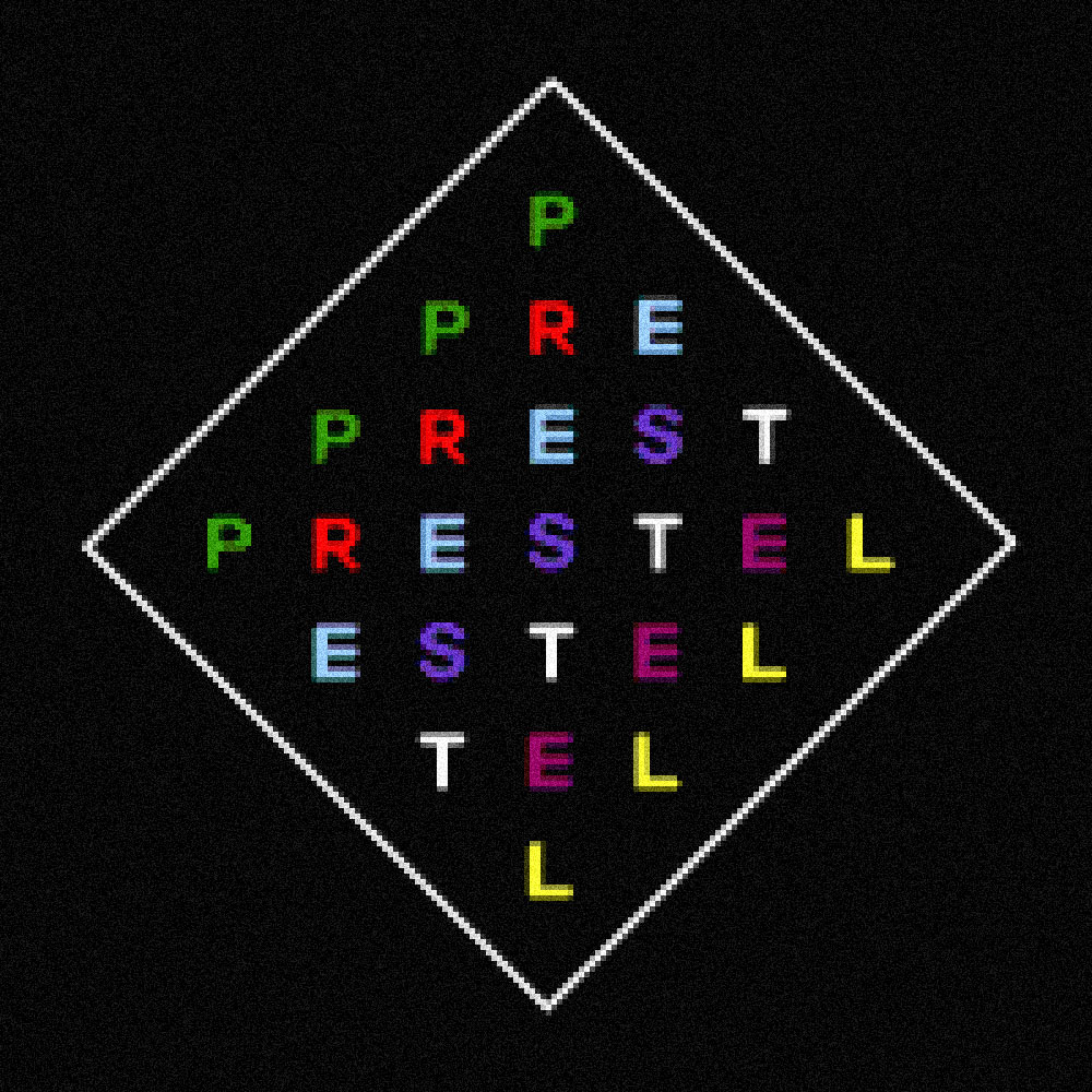
In another seminar on 14 February 1979, Mervyn Kurlansky (of London design firm Pentagram) spoke of his realisation that the word ‘Prestel’ has the same number of letters as the medium does colours, represented in his diamond-shaped textmode logo for the service, with each letter assigned a different colour. He also commented that it was difficult to give IPs’ pixel art logos any sort of individuality, given that there was a certain “sameness about the end results.”
At the same seminar, five designers were tasked with reproducing a railway timetable. Hilary Whelan, later of Datasolve and author of Designing on Prestel, was the only one to design a graphic identity for her pages – “a ‘lego-railway line’ which dovetailed into a banner for the top of each information page.” According to Whelan, the intention was to give the user “some degree of interest other than pure information.”
Sources
- Prestel, the editorial opportunity: A report of the first year of editorial research, Mills and Allen Communications, March 1979



Recent Comments